Scottish Esports League - Building the Brand
- Dale R Murray

- Jun 19, 2023
- 3 min read

When Esports Scotland told us Scottish Esports League was coming back for a fourth season, we took some time to look in the mirror and really reflect on what it was we were building, and what the future of the league had in store.
Being the biggest esports league in Scotland, creating a deep understanding of the audience cemented our design motivations - creating a premium competitive gaming entertainment product while remaining grounded in the grassroots. Giving players, fans, staff and sponsors something to be taken seriously and take pride and ownership over.

Having already lead the full rebrand in 2019 for SEL3, we wanted to keep a lot of the core identity the same but review what didn't reflect the brand's fourth year maturity.
In SEL3, we redeveloped the logo and created an identity system for each of the games being run in the league, aiming to make it easier for players and fans alike to immediately identify when content was about their favourite game.

Going back to the drawing boards we realised we were happy with the concept, but we just hadn't pushed the concept far enough and there still wasn’t enough differentiation between each game. Thusly, we dropped the single coloured antler and went for a bolder more easily identifiable system, utilising each game’s individual colour across the board so at any glance you know exactly which game the visual is pertaining to.

SEL3’s identity system of having signifying colours for each game also wasn't helped by the desaturated muted shades we chose for each title and didn’t give an instant feeling of excitement that the biggest esports event in Scotland ought to have. It’s an exciting event so why not have exciting colours to match!
For the league, one of the big challenges was making it look and feel Scottish, but without slapping tartan, hey jimmies, haggis, Nessy, claymores, castles, highland coos, mountains, bagpipes, Celtic knots, stags, grouse, whiskey, shortbread, thistles, and Mel Gibbson’s luscious locks all over it. That's a lot of stuff that's iconicaly Scottish but had to be utilised appropriately!
The design we settled for is a blend of the antlers of a Scottish stag combined with a shield to create the crest. The stag: symbolising majestic strength and nobility, a dynasty of greatness. The shield: to reflect the clashing of forces in the league and the history we have as a country. And when combined they resemble the head and leaves of a thistle, Scotland's national flower.

One visual not mentioned above is of course Scotland's flag, the Saltire. Not wanting to go too on the nose we took the core shape of the saltire’s cross and extracted this shape from it.

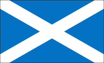


Once we had this core shape, there were lots of things we could then develop around it. Patterns, shapes, transitions and other motion graphics. Together they encapsulate the sharp competitive edge of the league, its host country and the trajectory of the teams, players, and league.


This project is what really kicked things off for CROFT, so it holds a special spot in our hearts and still remains the best local esports event Scotland's had in part to the brand we created and how much it's resonated with the fans, truly giving something for the community to be proud of.
For an even more in depth deep dive click here

Dale R Murray | Esports Creative Director
Let's Connect


Comments